Hallelujah! Plex has recently announced a Roku Plex update in the form of a new Plex channel for Roku devices and it is one hell of an improvement!! You can see the announcement from Plex on the Plex blog.
I recently wrote about the comparisons between Kodi vs Plex and pointed out that one of the short comings of Plex was the basic visualizations on several of their platforms - especially Roku devices. Plex is addressing this short coming with an all new Plex channel for Roku devices.
The new version of Plex on Roku is now available to Plex Pass subscribers as a preview to install along side the existing Plex channel. The new plex channel is, as mentioned, a preview and is meant for Plex Pass users to test drive. There are some features which are not yet implemented (and certainly are necessary before full roll out). [Read: What Plex Client Hardware is Right for You?]
If you don't already have a Plex Pass, no worries. Plex has indicated that they will be making the channel available to everybody after the preview period. For those of us who have already purchased the Roku channel, Plex has also indicated that when the preview period ends, existing users will automatically get the updated app. There is no word on how long the preview period will be.
Those of you who have used the Rarflix fork, will also be pleased to know that Plex appears to have retained the services of Rob, the fork's developer for the creation of this channel.
Table of Contents
Installation of the New Plex Channel on Roku Devices
Installation is simple - and the folks at Plex have laid out these quick steps to get your new Plex channel up and running:
- Log into your Roku account at https://owner.roku.com/add/PlexPass
- Press the “Yes, Add Channel” button
- Return to your Roku and visit ‘Settings > System > System Update’
- Choose “Check Now” to (force) update the channels on your Roku
- Enjoy!
Roku Plex Update - Initial thoughts:
I've only played with the new Plex channel a little bit and here are some of my initial thoughts:
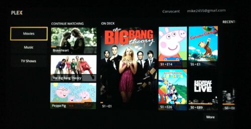
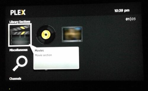
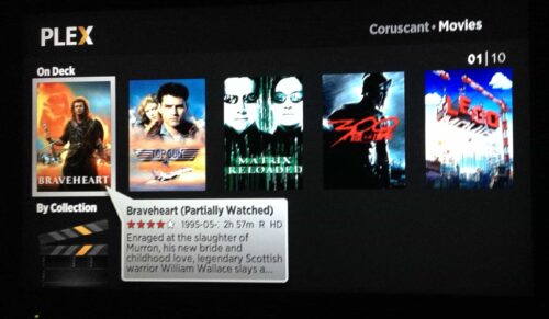
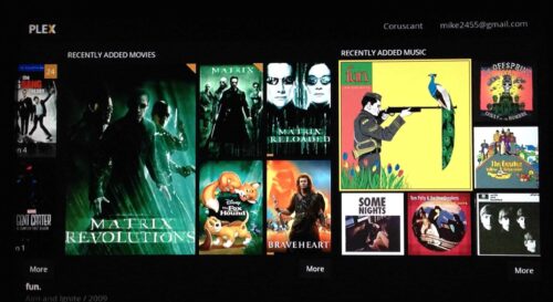
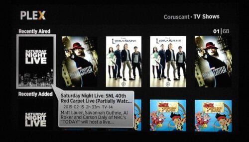
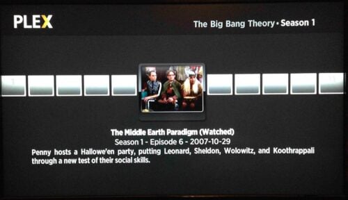
- It looks a LOT better. Like a lot. If you don't believe me, check out the comparison images below.
- Plex is moving towards their new redesigned home screen with this application. Xbox Plex users will be familiar with this (and users of any Plex App released since about October 2014). This is different from the traditional interface many might be used to and reminds me a bit of Netflix.
- Collection - There currently is no way to browse any collections. This is a major draw back for me personaly
- Limited Search Capability - I like to search for movies by genre, age, etc. and this functionality is currently not within the new Plex channel. Plex has, however, indicated they are working on this.
- Flexibility - There doesn't yet appear to a way to customize the categories the new home screen is displaying. This drives me crazy and based on comments I've read, I don't think I'm alone.
- Did I mention that is looks a lot better? Well, it does.
This is a preview and there is still some basic functionality missing, but I'm looking forward to seeing all of the new features added. A big shout out to the Plex team for a much needed update.
More New Plex Channel Images

Original Plex Channel Images

![10 Best Plex Client Devices [2022] - STUTTER-free Streaming Best Plex Client Devices](https://www.smarthomebeginner.com/images/2022/02/best-nas-for-plex-server-featured-images-from-pexels-photography-maghradze-ph-3764958-e1648542743772.jpg)
![10 Best Jellyfin Client Devices [2022] - 4k, Hardware Transcoding, etc. Jellyfin Roku App](https://www.smarthomebeginner.com/images/2021/02/jellyfin-roku-client-app-ft.jpg)
![10 Best Emby Client Devices [2023] - 4k, Hardware Transcoding, etc. setup emby server with raspberry pi](https://www.smarthomebeginner.com/images/2017/02/setup-emby-server-with-raspberry-pi.jpg)
![8 Best NAS with Plex Server Support [2022] - 4k, Transcoding, etc. Best NAS Server for Plex](https://www.smarthomebeginner.com/images/2020/02/best-media-server-for-plex-ft.jpg)