Oftentimes we're faced with interfaces that seem cluttered and hard to work with, and this results in an off-putting experience as users. Luckily, some coders and interface designers care about this problem, and from time to time, we see simple and clean-looking designs such as the one that the Kodi Maximinimalism Skin brings. If you add to its simplicity the fact that it can be configured to work on less powerful devices, such as the Raspberry Pi or the Banana Pro, then it is no wonder that this Kodi low power skin is a great choice for a lot of Kodi users. [Read: 5 Best XBMC skins for Raspberry Pi]
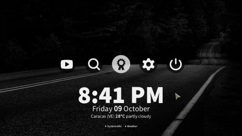
In this Maximinimalism skin review, we will take a look at the features it offers, and those that make it belong to the group of cool Kodi skins you can install in your HTPC. Kodi Maximinimalism skin includes touchscreen support, which makes it ideal for tablets and smartphones, as you probably read with us on our article about the best Kodi skins for touchscreens; however, if you run your setup using a wireless HTPC keyboard or a remote control app such as Yatse, the XBMC/Kodi remote, you can also interact in a pretty good way with this Kodi low power skin. Curious already? Let's take a look at the Maximinimalism Kodi interface plugin:
Best Wireless HTPC and Android TV Box Keyboards:
- Logitech K410 Living-Room Wireless Keyboard with Built-In Touchpad - $37.75
- Logitech Illuminated K830 HTPC Wireless Keyboard and Touchpad - $69.99
- iPazzPort KP-810-10AS Wireless Mini Keyboard Remote with Touch - $15.99
- Rii i8+ 2.4GHz Mini Wireless Keyboard with Touchpad - $22
- LYNEC C120Pro Mini Wireless Gyro Remote Keyboard Mouse - $13
Kodi Maximinimalism Skin: Keep it simple
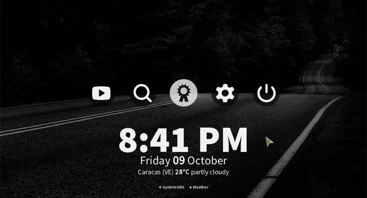
What you will see first when activating the Kodi Maximinimalism skin is the prevalent colors and shapes that you will be able to appreciate through most of the menus and screens: dark backgrounds, white letters, as few icons as possible and all of them in a rounded shape. It is visually appealing and makes it easy to find what you're looking for, that is, once you have associated the icon image to the feature you want. For example, when I was reviewing this skin, I didn't immediately associate the badge icon with favorites, but that's where you can find them.
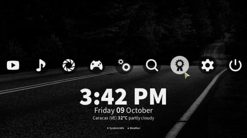
On the bottom of your screen, you will see the local time and, if you have a weather addon configured, the weather for your chosen main location. This makes the main menu ideal as an idle screen for your HTPC, if you need one, though you might want to raise the dimming percentage if that's your plan, otherwise you won't see anything.
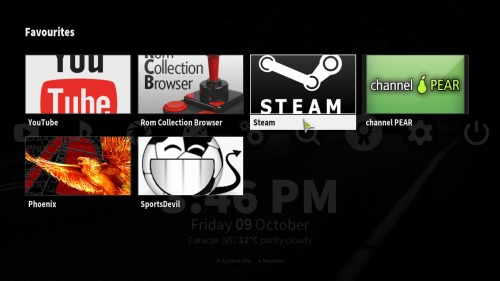
Upon selecting favorites on the main menu of the Kodi Maximinimalism skin, you will get a floating menu with rectangular big icons for each one of your favorites. This screen is arranged in a way that makes it easy to select them via touchscreen, air mouse, or directional arrow keys, translating into less time browsing menus and more time watching content. Of course, you should configure it first.
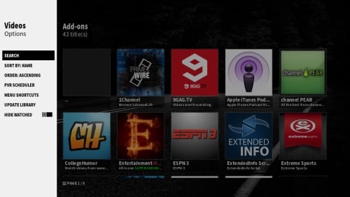
Selecting one of the other menu options, such as videos, lets you take a look at the most recent items you watched; particularly movies and TV shows, while also offering an option to update your library. If you select addons from this menu, you will see a list with big, square icons representing all of the available addons for your setup. A key feature of Kodi Maximinimalism skin (or limitation, depending on how you see it) is that these lists are not user configurable; to keep things at minimum you only get one visualization.
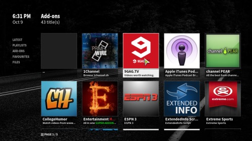
This of course, doesn't mean you don't get a sidebar. If you navigate to the right, you will get it, but it mostly has options not related to aesthetics, such as search and sort. There are other skins that let you change these visualizations such as the Amber Kodi skin, but the Kodi Maximinimalism skin is focused on keeping everything clean and to a minimum.
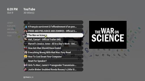
If you select a video addon you can experience the simple yet pleasing aesthetics we have been seeing throughout all of this Maximinimalism skin review. Take as an example the addon YouTube, and check out how it looks when you're browsing for content. [Read: Guide: How to install YouTube Kodi addon]

And here's how the skin looks when you pause it during playback:

Do you recommend using Kodi Maximinimalism Skin?
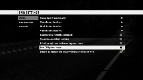
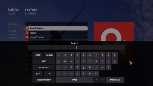
Kodi Maximinimalism skin cannot be configured regarding visualizations, however, the default one is pretty neat looking. This, and the fact that there's a low CPU power mode that disables scrolling and fanart animations for use on limited hardware devices, outweighs the lack of customization of this Kodi low power skin. Here are some more images, of the menu where you can configure the low power option, and of the search function (the onscreen keyboard looks pretty good)
If you are looking for a good low power Kodi skin for your low-end HTPC, or if you are interested on a simple looking interface that is visually appealing with little to no configuration, then the Kodi Maximinimalism skin is for you. If, on the other hand, you value being able to set a skin to your liking, perhaps you'd be better off checking a more configurable option. You can read how to install Nebula Kodi skin if this is the case, a skin that offers two themes (light and dark) and other configuration options. Or you could also check our top Kodi skins list, if you need to browse more options.

![15 Best Jellyfin Plugins [2023] - Supercharge your Media Server Jellyfin Intros Plugin Preview Pre-Roll](https://www.smarthomebeginner.com/images/2022/08/jellyfin-intros-preroll-preview.jpg)
![8 Amazing Raspberry Pi Ideas [2022]: Beginners and Enthusiasts Raspberry Pi ideas](https://www.smarthomebeginner.com/images/2021/09/raspberry-pi-4-dev-board.jpg)
![10 Best Plex Client Devices [2022] - STUTTER-free Streaming Best Plex Client Devices](https://www.smarthomebeginner.com/images/2022/02/best-nas-for-plex-server-featured-images-from-pexels-photography-maghradze-ph-3764958-e1648542743772.jpg)
![8 Best NAS with Plex Server Support [2022] - 4k, Transcoding, etc. Best NAS Server for Plex](https://www.smarthomebeginner.com/images/2020/02/best-media-server-for-plex-ft.jpg)
![10 Best Jellyfin Client Devices [2022] - 4k, Hardware Transcoding, etc. Jellyfin Roku App](https://www.smarthomebeginner.com/images/2021/02/jellyfin-roku-client-app-ft.jpg)
![10 Best Emby Client Devices [2023] - 4k, Hardware Transcoding, etc. setup emby server with raspberry pi](https://www.smarthomebeginner.com/images/2017/02/setup-emby-server-with-raspberry-pi.jpg)