A great media viewing experience starts with the interface used to browse your media. With this in mind, the Kodi team designed two new interfaces for Kodi Krypton v17. One of them, named Estouchy, is geared towards mobile devices. The other one -Kodi Estuary skin- is designed for general purposes. In this post we take a look at the Kodi Estuary skin. We got an Alpha version of Kodi Krypton downloaded to an Android device. Usually the tests for skins are better done on Kodi for Windows. In this manner, we can test the skin as we write. However, in this case, we were unable to download the Kodi Kyrpton Alpha version for Windows. Still, what we saw in the Kodi Estuary interface, makes it one of the best skins for Kodi, even before being officially released. [Read: 5 Must try Kodi skins for Amazon Fire TV]
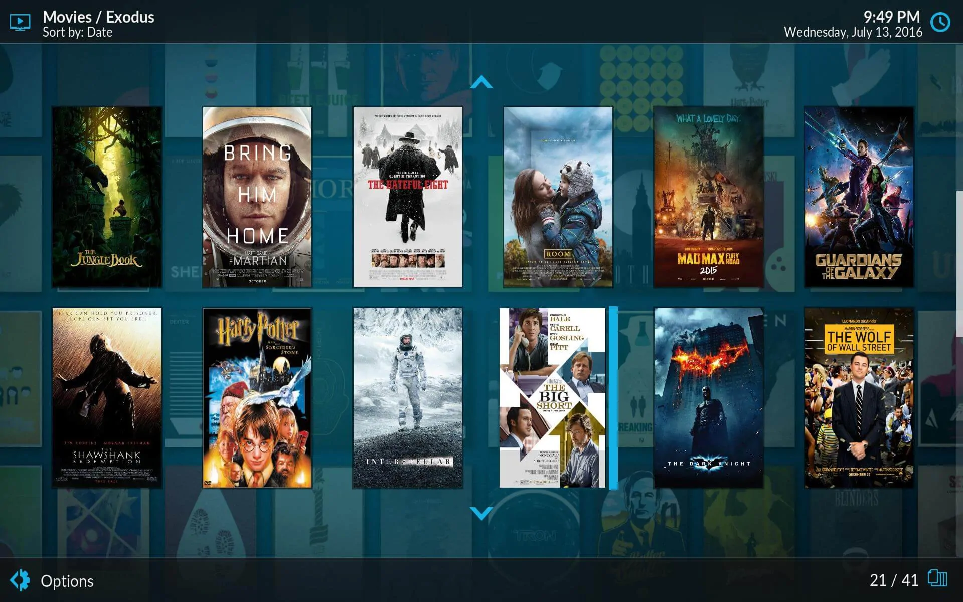
What we noticed first in the Estuary Skin review were the smooth transitions and animations that enhance the visuals of this skin. This interface comes up by default when you first start Kodi Krypton, instead of the traditional Confluence. Because of this, it will be the first impression for most new Kodi users. This skin does a great job being user friendly. Even though it is not designed for mobile devices, like these 10 best Kodi skins for touchscreens, I had a great time with it on my tablet. Some really condensed media information shows up when you scroll, which adds a level of interactivity superior to other skins.
Best Android TV Boxes:
- NVIDIA SHIELD TV Pro Home Media Server - $199.99
- Amazon Fire TV Streaming Media Player - $89.99
- WeTek Play 2 Hybrid Media Center - $134.00
- Kukele Octacore Android TV Box - $179.99
- U2C Android TV Box - $95.99
Kodi Estuary Skin: Kodi reinvented
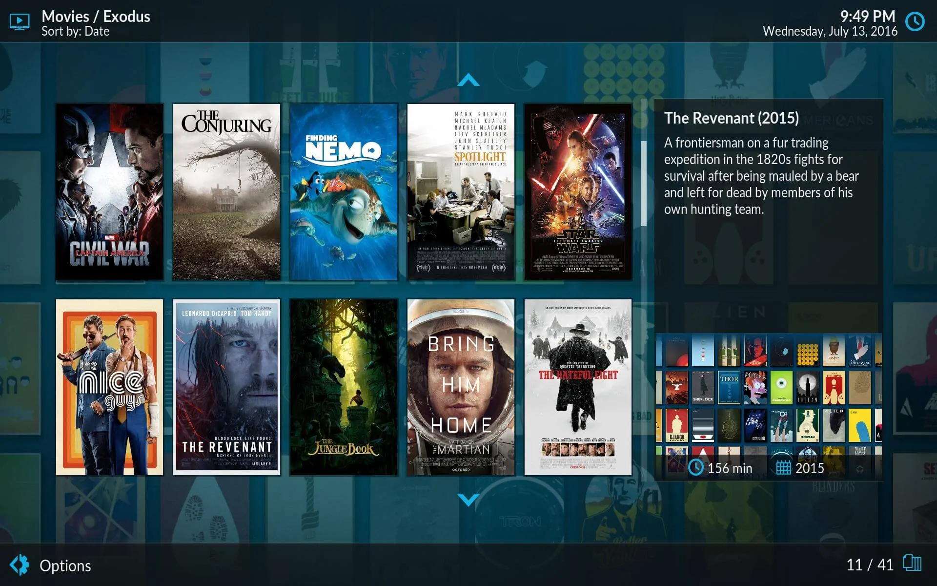
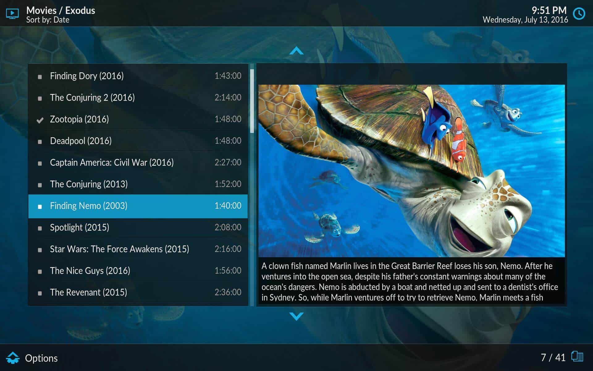
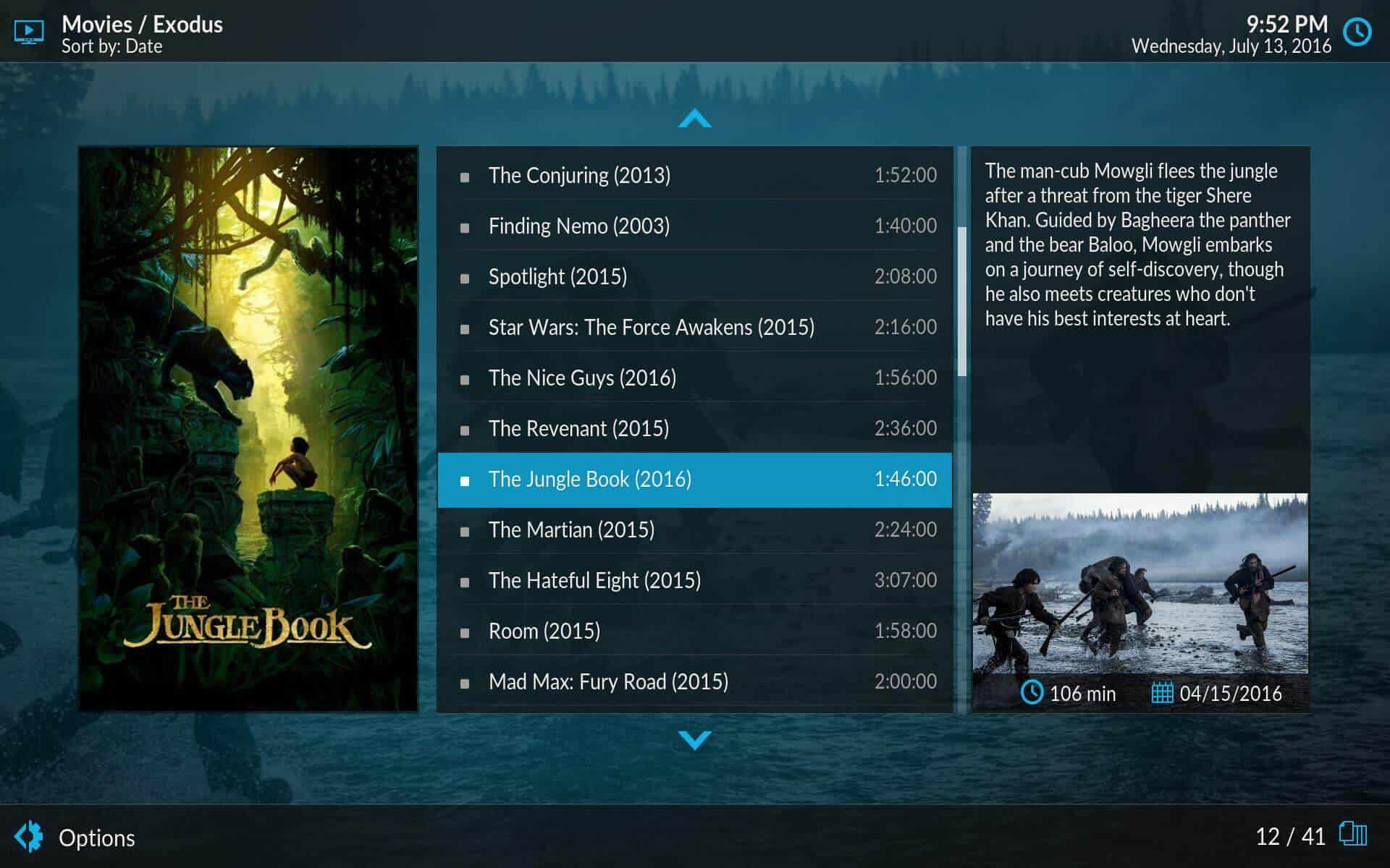
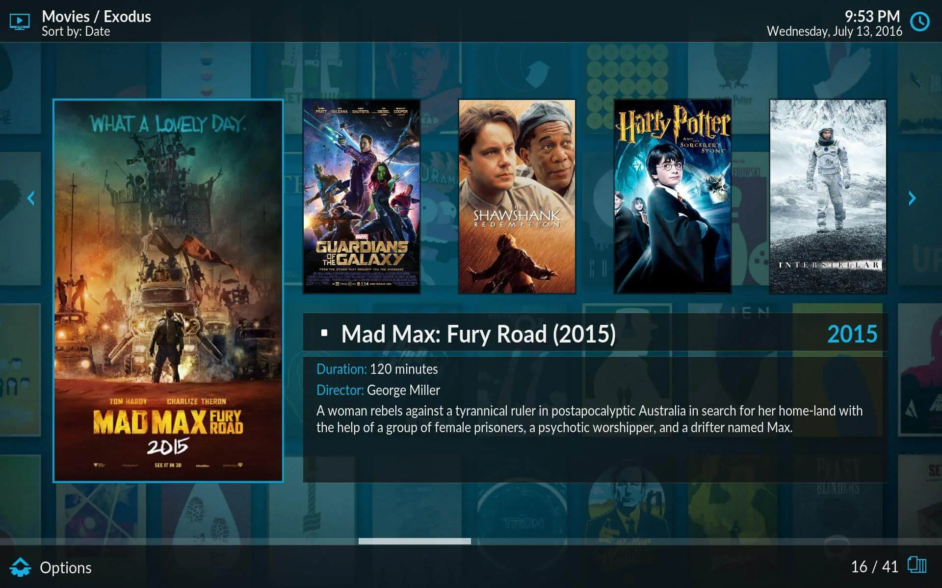
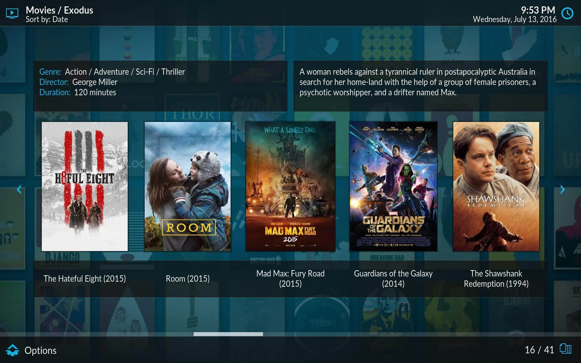
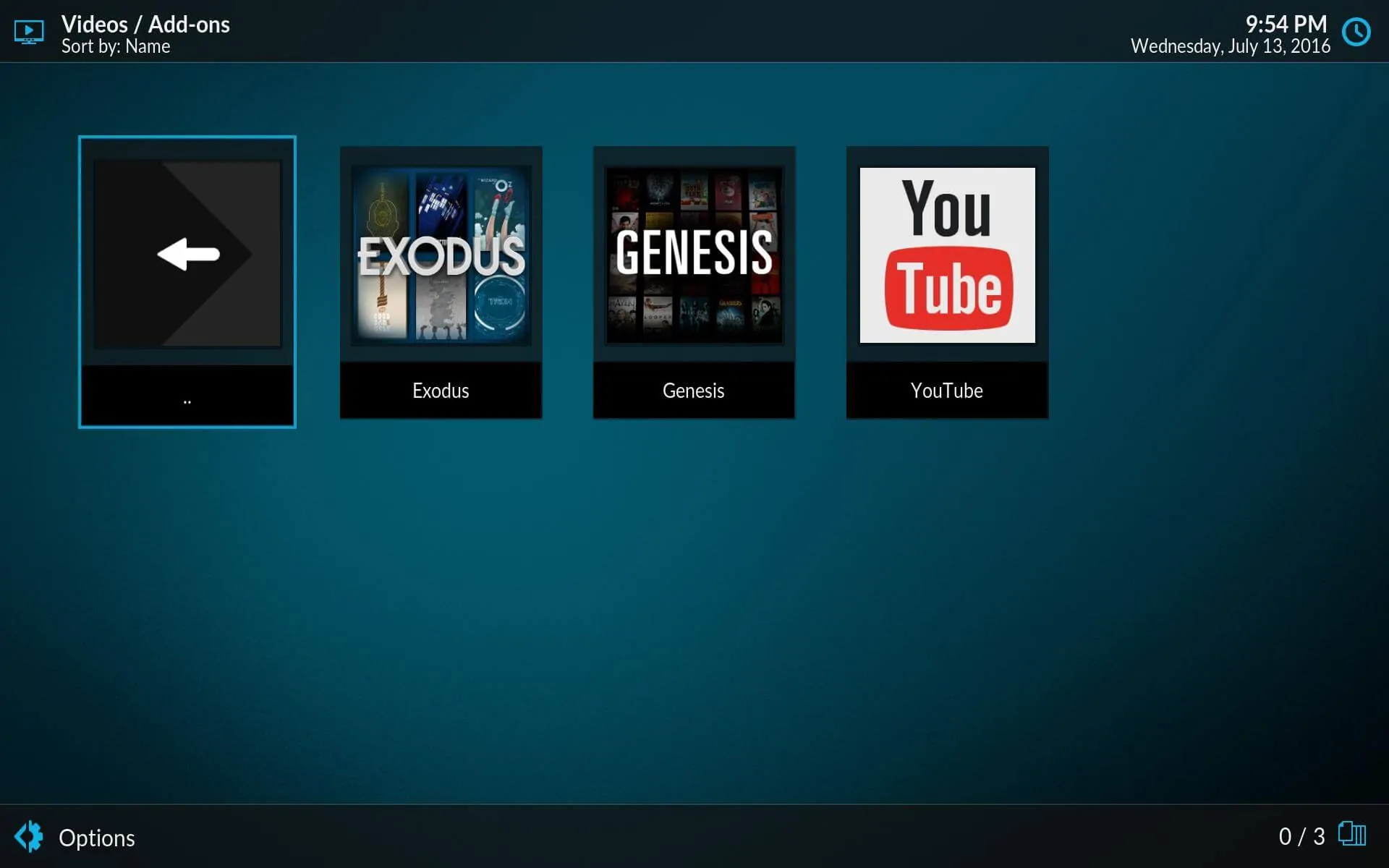
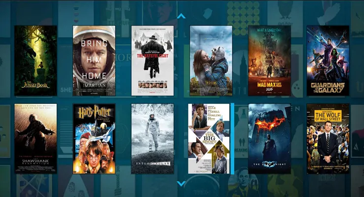
Kodi Estuary skin is basic, in the sense that it doesn't allow you to change theme colors or other fancy things. This is not to say that it is an ugly skin; on the contrary, it's aesthetically impeccable.You can define your own background image in the Estuary skin settings. Well-defined rectangles represent your movies and media items, and most visualizations allow you to see media information. However, to get through the visuals, you have to cycle through them, which is a disadvantage against skins that allow you to select your visualization from a menu, such as the Kodi Titan skin. Still, if you want to take a look at some of the visualizations on the Kodi Estuary skin, here are some pictures:
Kodi Estuary skin: do you recommend this skin?

Being the default skin for the upcoming version of Kodi, it is hard to tell you whether to download it or not. In our Estuary skin review, we saw that it will get automatically downloaded when you update Kodi. The Kodi Estuary interface will then replace Confluence. With its fully functional seeking bar, and its attractive visualizations, the Kodi Estuary skin will surely be a good replacement for Confluence. However, you will also be able to switch back to that skin if you don't like the Kodi Estuary interface.
What I could suggest to you would be to try it out once Kodi Krypton is released. This way, you will be able to tell if it enhances your media experience. If you want to get skins for your Raspberry Pi, take a look at these 5 best Kodi skins for Raspberry Pi. If you use the Amber or Titan MediaBrowser Kodi skins, learn how to set Kodi default view in Amber and Titan MediaBrowser skins. Get the proper skin for your Kodi media player with our skin reviews!

![15 Best Jellyfin Plugins [2023] - Supercharge your Media Server Jellyfin Intros Plugin Preview Pre-Roll](https://www.smarthomebeginner.com/images/2022/08/jellyfin-intros-preroll-preview.jpg)
![15 Best Plex Alternatives [2022] - FREE and BETTER Options Best Plex Alternatives feature image](https://www.smarthomebeginner.com/images/2022/08/best-plex-alternatives-feature-image.gif)

![8 Amazing Raspberry Pi Ideas [2022]: Beginners and Enthusiasts Raspberry Pi ideas](https://www.smarthomebeginner.com/images/2021/09/raspberry-pi-4-dev-board.jpg)
![10 Best Plex Client Devices [2022] - STUTTER-free Streaming Best Plex Client Devices](https://www.smarthomebeginner.com/images/2022/02/best-nas-for-plex-server-featured-images-from-pexels-photography-maghradze-ph-3764958-e1648542743772.jpg)
![10 Best Jellyfin Client Devices [2022] - 4k, Hardware Transcoding, etc. Jellyfin Roku App](https://www.smarthomebeginner.com/images/2021/02/jellyfin-roku-client-app-ft.jpg)